School Blog

Monday 31 October 2016

Rule of thirds.


The rule of thirds:

The rule of thirds is applied by aligning a subject with the guide lines and their intersection points, placing the horizon on the top or bottom line, or allowing linear features in the image to flow from section to section.  The image is split up into 9 boxes which shows where the subject is placed in an image. It can be used both portrait and landscape. It’s been proved that the human eye doesn’t actually look at the centre of an image when its looked at. This means that the subject does always have to be in the centre of the image due to the human eye not automatically been focused to the main subject. 

Picture for school magazine mock up

Monday 17 October 2016

Front cover ideas.


These are my front cover designs, I created many front cover designs covering all the features that should appear on a front cover of a magazine. The first one is good as it shows all the aspects of a front cover and in my opinion the positions that I placed the features in were in good positions. The second one is not a personal favourite as I don't really like the positions of the features, in my opinion it looks better when the masthead covers the whole top of the magazine, rather that what I have done on this front cover design, and positioned the masthead on the right of the screen. The other designs I created are very similar to the first one and believe they are in very professional positions. My personal favourite one is the first one I created as it gives off a very professional yet simple look to the front cover. 

Monday 10 October 2016

My first PB magazine.


This is my mock up front cover for my Plantsbrook school magazine. I have kept the design to the red white and black colourway to keep the school colour theme. My masthead is large and gives the eye-catching affect. The use of red gives a very demanding effect and really stands out. Around the writing I used a black border and dark drop shadow which are slightly faded, which gives the stand out affect also. At the bottom of the page I used a banner which is slightly transparent which makes the whole magazine look more professional, it also makes the writing inside the banner standout. Towards the top right of the page I used a pug in the same effect as the banner, I gave it a slight transparent look. The image I used was off Mr Farr's blog and think it looks good as the picture has a short depth of field, which means its more focused and gives the area around the main focus a slight blur, which suggest the picture was took on a high quality camera which creates the professional look.

Monday 3 October 2016

Media Studies


Main image:

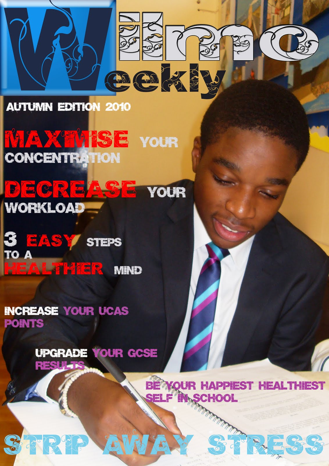
My image is going to be a medium close up shot, it is going to be of my Brother, it will be in the middle of the front cover, he will be smiling in his school uniform. He will be looking down doing
his work.

Image result for school magazine


I want my main image to be like this one, so a medium close up of my brother doing his work in his school uniform.